6 Website Mistakes That Could Turn Customers Away
May 2016 Ratchet+Wrench Magazine: Avoid these common missteps to create a more engaging site by Anna Zeck
It’s no secret that having a website is crucial today—but simply having one is not enough anymore, says Marion Miller. What might have worked five or even 10 years ago won’t work today, she says, and shop owners need to recognize that. “The way to get people online now is to have more information, better information and the newest information,” she says.
As the owner of Complete Marketing Resources, Miller has spent her career helping shops build engaging websites that help convert customers. David Rogers, president of Automated Marketing Group, has similar experience and agrees with Miller.
“You want the right cars, the right customers. They need to understand who you are and what your brand is,” he says. “Your message can’t be jumbled up like that. You need to have a place where you are and your central message and everything should work in synchronicity.”
Although it sounds simple, both Miller and Rogers agree that many shop’s websites aren’t making the cut. And today, a poor website simply isn’t acceptable. Miller and Rogers break down the most common website mistakes many shops make and how to solve those to create a better, more engaging website.
Mistake #1: Not owning your URL address
It may sound trivial, Miller says, but one of the biggest and most troubling website mistakes she sees is when a shop owner does not know who owns the URL address to the shop’s site, or when the shop owner has no administrative access to it. What happens, she says, is that when you switch providers, the provider frequently changes the URL address, so shops end up with four or five websites that are essentially competing with themselves online.
“A lot of time, that just falls through the cracks,” she says. “If they could make sure to buy the URL themselves and keep access to it themselves, that’s huge.”
If you don’t own your URL address, Miller says that you should research online who owns it, contact the owner and request to purchase it from the company.
Along the same lines, Miller also says that you need to make sure you own the content on your website. Some website design companies copyright not only the sites they create, but also the content, meaning everything belongs to them.
“It’s a way to keep you with them,” she says. “If you switch providers, you would have to start over.”
If you work with a website design company, she says to look at your contract and make sure that your website isn’t copyrighted or owned by that company.
Mistake #2: Not having a responsive website
According to research firm Smart Insights, mobile visits made up 51 percent of all website traffic in 2015, which is why it’s crucial that your website is responsive, says Rogers. And yet, both Miller and Rogers say that many websites they encounter are not.
“Responsive means that one site is going to work on all devices,” Rogers says. “When your phone number is on there and I’m on my mobile phone, I want to touch that number on the front of your site and have it call you. If you’re not accommodating them, they’ll leave as soon as they get to your website.”
Rogers recommends taking a look at every page on your site and evaluating how well it works on a phone, computer and tablet. If it doesn’t work well, he says that it’s not costly to have someone build a responsive site for you and the benefits of having a site that’s easy for customers to utilize is huge.
Mistake #3: Using stock photos
Rogers makes no qualms about it: “Stock photos are the biggest no-nos in the web business,” he says.
When it comes to the outside of the facility, the waiting room and the front counter, he says you should never use stock photos. “When you’re trying to get an impression of the facility, we want to see a picture of the outside of the building. I don’t want any old random building,” he says. “It allows for more of a feeling of trust, comfort and familiarity. The last thing you want to do is start creating doubt before they get in the door.”
Using real photos is also a way to set yourself apart. You don’t want to look or sound like any other repair shop, he says, particularly not the same as the one down the street or with the same colors as you.
“That leaves you to fight over the crumbs because you decided to all look alike,” he says. “Everything on the website should be custom to your business.”
Stock photos are only acceptable, Rogers says, if you’re posting something like a blog post you’ve written about brakes or engine coolant. Those images (a stock photo of a brake system design or an engine cooler, for example) can add something visual to the post.
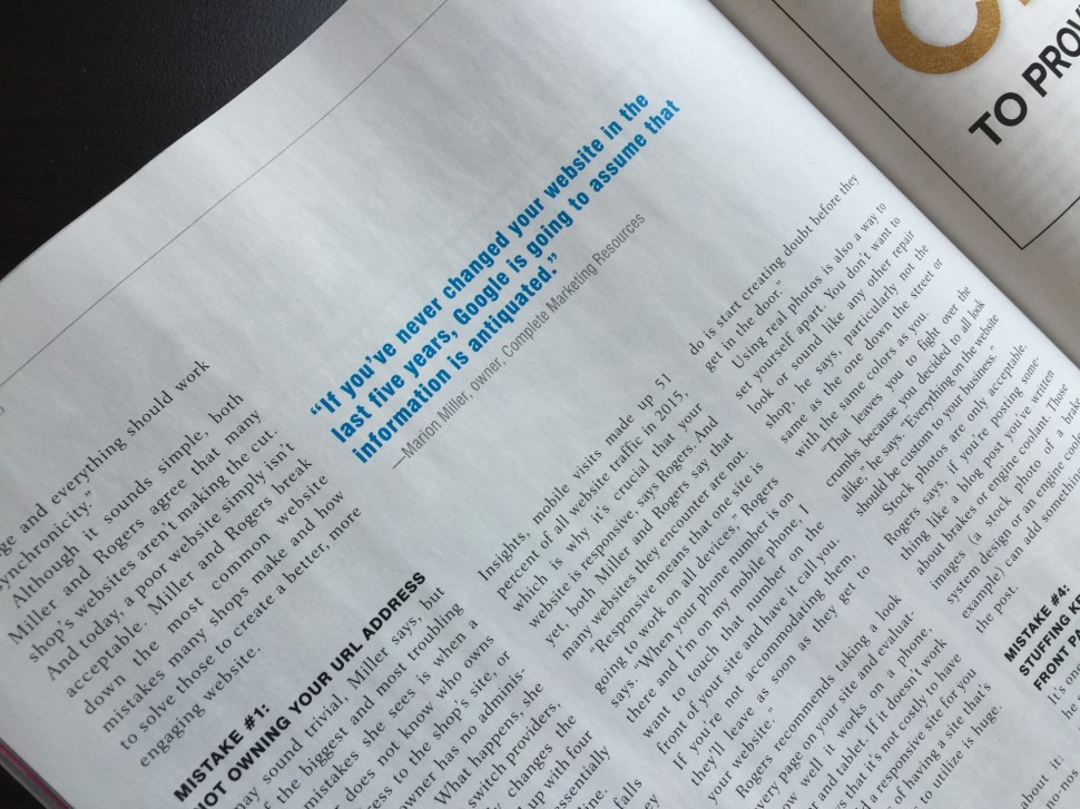
“If you’ve never changed your website in the last five years, Google is going to assume that information is antiquated.”
—Marion Miller, owner, Complete Marketing Resources
Mistake #4: Stuffing keywords on the front page
It’s one of the most repeated mistakes he sees, Rogers says, and it’s one that used to be perfectly acceptable: Listing every service a shop does on the front page.
“We used to play games like that,” he says. “Google punishes you for things like that now. SEO is important but Google prefers that you build your website for the people using the site, not the search engine.”
Instead, Miller says that a site should have at least 10 pages, and in fact, a basic website package with her company is 66 pages deep. That could include a services page, an about page, a contact page, an appointment page, and an affiliations page, among others. You still convey the same information, she says. It’s just laid out in a different way that’s more user friendly.
“It just adds more depth and weight,” she says. “For us, we only have five or six pieces on the menu bar and everything flows underneath that.”
The site should also pass Miller’s two-click test: You should be able to get where you want to go on the website in only two clicks. That means that it’s easy to navigate and not simply a long block of text that takes too much time.
Mistake #5: No calls to action for new customers
Your website is, first and foremost, a prospecting tool for the new customer, Rogers says. It’s a sales tool that first brands you and then takes you on the sales pathway, which ends with taking action. What a website should not be, Rogers says, is a static brochure.
“You’re the expert. You have to say, ‘Click here, call now, make an appointment,’” he says. “It’s really key that I tell you what to do without seeming like I’m talking to you.”
The content on the website needs to lead the customer down the rabbit hole, Rogers says, which could be many different actions: setting an appointment, calling the shop, following the shop on various social media platforms.
That’s why you need to have an online appointment feature, specials or coupons that can be downloaded, a link to sign up for a monthly email newsletter, etc. Miller says to think about ways that your customer would interact with your site and what they may be looking for. Then create content or actions that help the customer do that.
Mistake #6: Never updating your website
Both Rogers and Miller agree that never refreshing or adding content to the website is one of the biggest problems that can have significant consequences for SEO success.
“If you’ve never changed your website in the last five years, Google is going to assume that information is antiquated,” Miller says. “Search engines are looking at information continuously and they’re going to send someone to that newer information.”
Rogers says that one of the worst things you can do is treat your website as a single static item and hope it brings in new customers. Instead, you need to treat your website as an information hub, which will not only make your website more valuable to customers, it will also help drive up your organic search results on search engines. Changing your website could be as simple as adding testimonials or simply changing a paragraph, or as extensive as regular blogging (which Rogers recommends).
“Blogging started out as a way to blurt out what you feel. Never do that. This is not a personal blog,” Rogers says “This is part of your advertising goal.”
Rogers says that a good blog post provides valuable, interesting information in a concise way. He says that you could use the concepts of seasonal advertising to write a blog post about how to build a survival kit for your car, what to do in the event you hit a curb, or any news from the automotive industry that could impact customers.
“It’s relevant, it’s pertinent, it’s seasonally fitting,” he says. “It’s very current and it’s something you can write in your own voice with your own knowledge.”
Although there is a huge amount of content available on the Internet, Rogers says it’s important to write in your own voice and not copy and paste information, which would be plagiarism. Content that’s not unique is a huge no-no for Google, he says, so he advises against recycling material. He also recommends being genuine and conversational without going on for too long. Finally, he says the blog needs to be formatted well and be legible.
This article appears in the May 2016 Ratchet +Wrench Magazine by Anna Zeck issue of Ratchet+Wrench.
Did you like what you read here? Subscribe to Ratchet+Wrench
- I was proud to be a small part of this work by Anna Zeck and it was a pleasure to work with her, Marion M Miller, President - CEO JASPER Websites by CMR Inc